
Product Page Optimization: Anatomy of a Page That Sells
Most ecommerce stores convert just 1.5 to 3 percent of visitors. This guide breaks down the anatomy of a product page that sells, from imagery and proof to mobile patterns and checkout friction.
The Short Answer
Product page optimization is the work of turning a product page from a simple listing into a confident salesperson. Most shoppers arrive with a question, not a decision. They want to know what the product is, whether it will work for them, whether they can trust the seller, and how easy it is to buy.…
Product page optimization is the work of turning a product page from a simple listing into a confident salesperson. Most shoppers arrive with a question, not a decision. They want to know what the product is, whether it will work for them, whether they can trust the seller, and how easy it is to buy. A strong page answers every one of those questions in order. That is why the product page, more than the homepage or any campaign landing page, decides how much of your traffic becomes revenue.
The numbers explain the stakes. The global average ecommerce conversion rate sits between 1.5% and 3%, while the average Shopify store converts at about 1.4%, based on Littledata data covering 2,800 Shopify stores. The top 20% convert at 3.2% or higher, and the top 10% reach 4.7% or higher. Baymard Institute puts average cart abandonment at 70.22% across 50 studies, so roughly seven in ten shoppers who add an item to a cart never complete the purchase.
Product Page Optimization Starts Above the Fold
The first screen a shopper sees does most of the persuading. Within a few seconds, a visitor should be able to identify the product, understand its main benefit, see its rating, and find the way to buy it. If any of those elements is missing or buried, the shopper has to work to understand the offer, and most will simply leave.
A strong above the fold layout follows a simple order. The product title is specific and plain. The star rating and review count sit directly under the title. A short benefit led summary explains the outcome the product delivers, not just its features. The variant selector, quantity, and add to cart button are visible without scrolling, and shipping and returns information appears close to the button, because that is the moment doubt arrives.
Imagery That Answers Questions Before They Are Asked
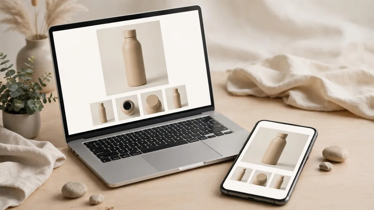
Online shoppers cannot touch, hold, or try a product, so images carry the weight that a physical store would give to the product itself. Strong pages typically use five to eight product images, and the best pages treat each image as an answer to a specific question. The first image should show the product clearly on a clean background. The following images should show it in use, from different angles, at true scale next to a familiar object, and with close ups of materials, stitching, buttons, or other details that signal quality.
Lifestyle images help the shopper imagine the product in their own life: a bag on a desk, a lamp lit in a living room, a jacket worn outdoors. Short product videos add another layer, especially where movement, size, or assembly matters. A 15 to 30 second clip showing the product in action often resolves the exact doubts that stop a purchase.
Copy That Sells the Outcome, Not Just the Specification
Product copy fails most often in one of two ways. It is either a thin list of specifications with no explanation of why they matter, or a wall of marketing language that never says anything concrete. Good copy does both jobs: it states the facts, then translates each fact into a benefit the shopper can feel.
Start with the outcome. Instead of leading with a technical detail, lead with what changes for the buyer. Then support that claim with the specification, the material, the measurement, or the feature that makes it true. Use short paragraphs and scannable bullet points for the details, and keep sentences plain enough that a first time visitor understands them in one read.
Handling Objections Before the Shopper Leaves
Every product page is a negotiation with doubt. Shoppers silently ask whether the product will fit, whether it will last, whether delivery will be slow, and whether returns will be painful. A page that sells answers those objections in the open, near the point where they arise, instead of hiding the answers in a footer or a separate policy page.
Shipping and returns information belongs above the fold, in plain language: the delivery timeframe, the delivery cost or free delivery threshold, and the returns window next to the add to cart button. Baymard Institute found that unexpected extra costs at checkout are a leading reason shoppers abandon carts, and clarity early in the journey removes the surprise that kills the sale later.
Proof: Reviews, Ratings, and Social Evidence
Shoppers trust other shoppers more than they trust sellers, so proof should be visible from the first screen and detailed further down the page. A star rating under the title sets the tone. A reviews section below the main content provides the depth: verified purchase labels, photos from real customers, and reviews that mention specific uses, sizes, and outcomes.
Do not hide imperfect reviews. A page with only five star reviews looks filtered, while a page that includes a thoughtful three or four star review alongside the praise looks honest. A calm, helpful public reply to a critical review shows future buyers that problems are handled, not ignored.
Removing Checkout Friction at the Source
Most checkout friction is created on the product page, long before the shopper reaches the checkout itself. Confusing variant selectors, out of stock options that look available, quantity controls that are hard to tap, and an add to cart button that gives no feedback all create small moments of frustration. Each one is a reason to leave.
Make the path to purchase boring in the best sense. Variant options should show clearly which combinations are in stock. The add to cart button should confirm the action instantly, with an easy route to checkout. Guest checkout should be available, because forcing account creation is one of the most common reasons shoppers abandon a purchase. Payment options should include the methods your audience actually uses, including digital wallets, and security badges should sit near the button.
Product Page Optimization for Mobile Shoppers
Mobile is no longer a secondary channel. Smartphones generate roughly 78% of global ecommerce traffic, according to 2026 figures from Salesforce and other panels, and mobile commerce accounts for about 60% of global online sales, according to Statista. Yet mobile conversion still lags behind desktop on many stores, and the product page is where that gap is won or lost.
Design for the thumb first. The add to cart button should be large, easy to reach, and visible without scrolling back to the top. A sticky add to cart bar that follows the shopper as they scroll through images and reviews is one of the most effective mobile patterns, because it removes the need to scroll back up to buy. Variant selectors should be tappable, not tiny dropdowns. Quantity controls should be large enough to use with one hand.
The New First Impression: AI Referred Visitors
A growing share of shoppers now arrives through AI assistants rather than through a homepage or a category page. Shopify reported that 50% of AI referred sessions in the second quarter of 2026 landed directly on a product page, and that those sessions grew 197% year over year. Shoppers referred by AI tools also converted about 80% better than organic search referrals once they reached a product page, according to Shopify. These visitors arrive further along in the buying process, with a specific product already in mind, and they expect the page to confirm the choice immediately.
That changes what a product page must do. It can no longer assume the shopper has browsed the store and understands the brand. The page must stand alone: clear title, accurate specifications, honest reviews, and visible delivery and returns terms. Structured, accurate product data matters here, because Shopify found that searches drawing on structured catalog data converted about twice as well as those relying on scraped or third party feeds. For stores planning for this shift, the move toward agentic checkout, where AI agents help complete purchases, makes a self contained, trustworthy product page even more important.
Measuring Product Page Optimization the Right Way
Optimization without measurement is guesswork. Track the metrics that show where shoppers drop off, and change one element at a time so you know what caused the improvement. The most useful product page metrics are add to cart rate, product page to checkout rate, conversion rate, revenue per visitor, and exit rate from the product page. Together they show whether the problem is attraction, persuasion, or checkout friction.
| Metric | What it tells you | Healthy signal |
|---|---|---|
| Add to cart rate | Whether the page persuades shoppers to take the first step | Rising after imagery or copy improvements |
| Product to checkout rate | Whether shoppers who add to cart keep going | Steady improvement as objections are answered |
| Conversion rate | Overall buying performance of the page | Moving toward 3% or higher over time |
| Revenue per visitor | Whether changes lift value, not just clicks | Growing alongside conversion, not instead of it |
| Exit rate | Whether shoppers leave without acting | Falling after mobile and speed fixes |
A Practical Product Page Checklist
Use this checklist to audit any product page in under ten minutes. Score each item honestly, then fix the lowest scoring items first, because the weakest link sets the ceiling for the whole page.
- Title is specific, and the main benefit is clear in one or two lines.
- Star rating and review count appear directly under the title.
- Five to eight images cover the product in use, at scale, and in detail, plus a short video where it helps.
- Variant, quantity, and add to cart controls are visible above the fold and easy to use on mobile.
- Shipping, delivery time, and returns terms are stated plainly near the buy button.
- Reviews include verified purchases, customer photos, and honest responses to criticism.
- Specifications, compatibility, and what is included are easy to find and scan.
- Guest checkout and familiar payment methods are available, with trust signals near the button.
- The page loads fast on a phone, and a sticky add to cart bar keeps buying within reach.
- Product data is accurate and complete, so AI assistants and search engines describe it correctly.
The underlying platform matters too. A fast, flexible storefront makes every one of these improvements easier to ship and test. Our guide to headless commerce and building a faster online store explains how that foundation supports the page level work described here, and our ecommerce development services cover the full build, from product page design and mobile checkout to integrations and performance tuning.
Frequently Asked Questions
What is product page optimization?
Product page optimization is the process of improving every element of a product page, including imagery, copy, reviews, layout, and checkout flow, so that more visitors complete a purchase. It combines design, persuasion, and measurement, and it focuses on removing doubt and friction at the exact moment a shopper decides whether to buy.
What is a good product page conversion rate?
Most ecommerce stores convert between 1.5% and 3% of visitors, while the average Shopify store converts at about 1.4%, according to Littledata. A rate above 3% puts a store in the top 20% of Shopify stores, and above 4.7% puts it in the top 10%. The right target depends on your category and average order value, so compare against your own history and your industry before chasing a single number.
How many product images should a product page have?
Strong pages typically use five to eight images. Include a clean hero shot, the product in use, different angles, a sense of scale, and close ups of materials or details. Add a short video when movement, size, or assembly matters. Every image should answer a question a shopper would otherwise have to guess at.
Why do shoppers abandon their carts after viewing a product page?
Baymard Institute puts average cart abandonment at 70.22%, and the reasons usually start on the product page: unclear shipping or returns terms, missing information, weak imagery, or a confusing path to checkout. Shoppers also abandon because they are still comparing options or are not ready to buy. Clear information, honest reviews, and a smooth checkout reduce the avoidable share of abandonment.
How important is mobile product page optimization?
It is the most important part of product page work for most stores. Smartphones generate roughly 78% of global ecommerce traffic, yet mobile conversion often lags behind desktop. A sticky add to cart bar, tappable variants, short scannable sections, and fast loading make the biggest difference on small screens, and they should be tested on a real phone before any page is considered finished.
How do I know if my product page optimization is working?
Track add to cart rate, product to checkout rate, conversion rate, revenue per visitor, and exit rate before and after each change. Change one element at a time, run A/B tests with a meaningful sample, and use session recordings to see where shoppers hesitate. For broader tactics that bring more qualified visitors to those pages, see our guide to ecommerce growth strategies to boost sales in 2026.
Ready to turn your product pages into your best salespeople? Contact Skills Technology Solutions and tell us about your store. We will audit your product pages, find the friction that is costing you sales, and rebuild them to convert.
Related Articles
Keep reading — more guides you may find useful.

Related Services
Services connected to this guide.